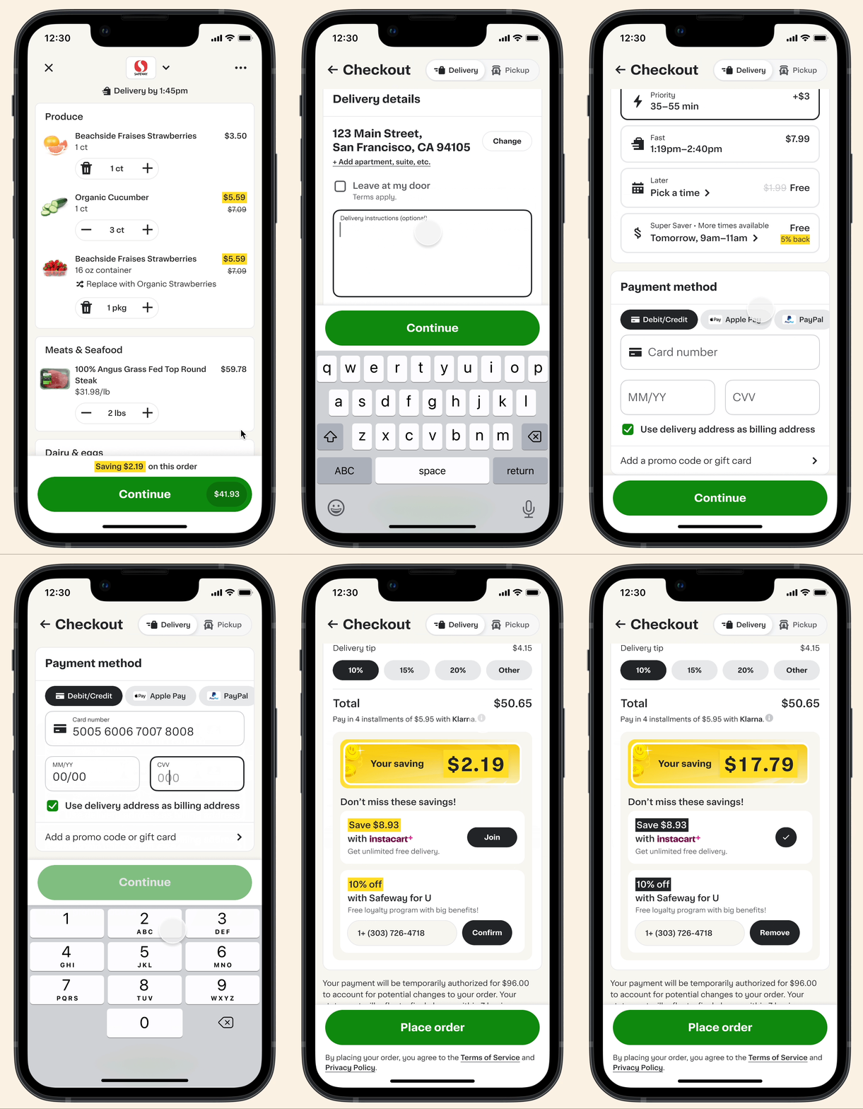
Checkout Reimagined
Checkout should be as seamless and as few steps as possible but that can be a hard task to accomplish when it comes to multiple required steps that rely on each other before placing your order.
What frustrates you when trying to place an order online?
Overview
Role
Lead Product Designer
Timeline
Two weeks
Stakeholders
Product Manager
Engineer Lead
Product Managers for all features that touch checkout
(ex: loyalty, payments, membership, etc)
Director of Product Design
Director of Product Management
Problem
Business: The time it takes for a user to checkout is longer than we'd like with multiple required steps.
How might we create a checkout experience that is frictionless and creates confidence in our users?
User: I can't figure out what is required when checking out and noticing the place order button isn't active which is frustrating because the amount of steps there are, I can't figure out what I did wrong.
Solution
Create a seamless experience by grouping information together and walking the user through checkout so they don't miss a step.